Can Paint Really Make You Happier?

 We all know that we are a better person when we’re calm and happy. Being happy these days however, is a challenge to say the least.
The Covid-19 pandemic is having a significant emotional and psychological effect on people from all walks of life and in every affected country. The effects on the most exposed groups, like health workers, can even lead to post-traumatic stress disorder, as well as severe anxiety, depression, and other symptoms of distress.
 The social distancing and isolation have affected us and we all feel stress and anxiety in one way or another. We feel powerless and things can seem out-of-control.
Maybe it’s time to say “enough” and take some responsibility to try and control our micro environment – our homes. Our homes should be a refuge – not a jail, so why not turn our homes into feel-good spaces?
With a mood-altering coat of paint we can do wonders. “Colour is so influential in relation to how a room feels, therefore it can easily affect our mood and behaviour,” says Dulux colour expert Andrea Lucena-Orr. “As soon as you enter a room that’s bright or has a certain positive essence, you can’t help but feel uplifted and reinvigorated.”
Research by The Florey Institute of Neuroscience and Mental Health in Melbourne scientifically proves that different colours on walls can strongly influence a range of emotions. They can make us feel relaxed and calm, or cheerful and excited, while the wrong colour scheme can make us bored, sad, tense and even irritated.
Colour, of course is a fundamental building block of interior design, but beyond imagining how colours will look together and work in your home, it’s important to consider how they make you feel.
Colour psychology is the theory that colours can affect how you feel, think and act. For example, deep red hues are associated with passion and energy, whereas cool blue shades are considered calming and serene.
Here are some tips on how to use colours to set the right mood in your home, and try painting just one accent wall to see a big difference!

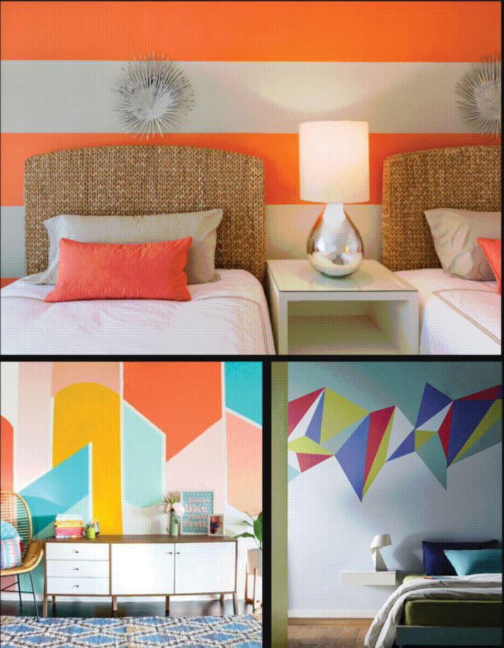
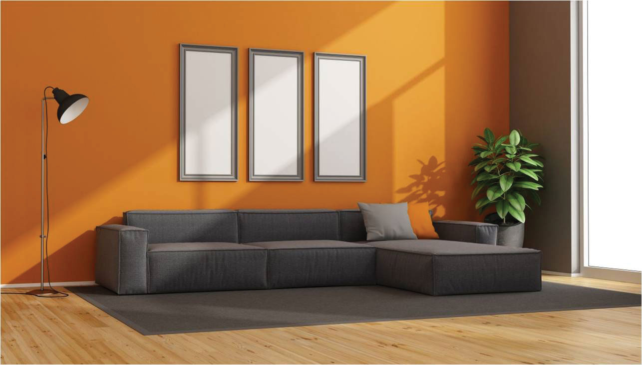 Orange
Orange is a high-energy color with a sense of fun, although it can be polarizing; people tend to love it or hate it. It’s usually a favorite of those who like to be known for their creativity and individuality. “In decorating, coppery oranges—both light and mid-tone—are really coming back into play,” Kate Smith of Sensational Color says. “Orange blends really nicely with neutrals, so definitely take a second look at it if you haven’t thought about it in a while. There are so many tones you can choose from, from pumpkin orange to terra cotta to peach.”
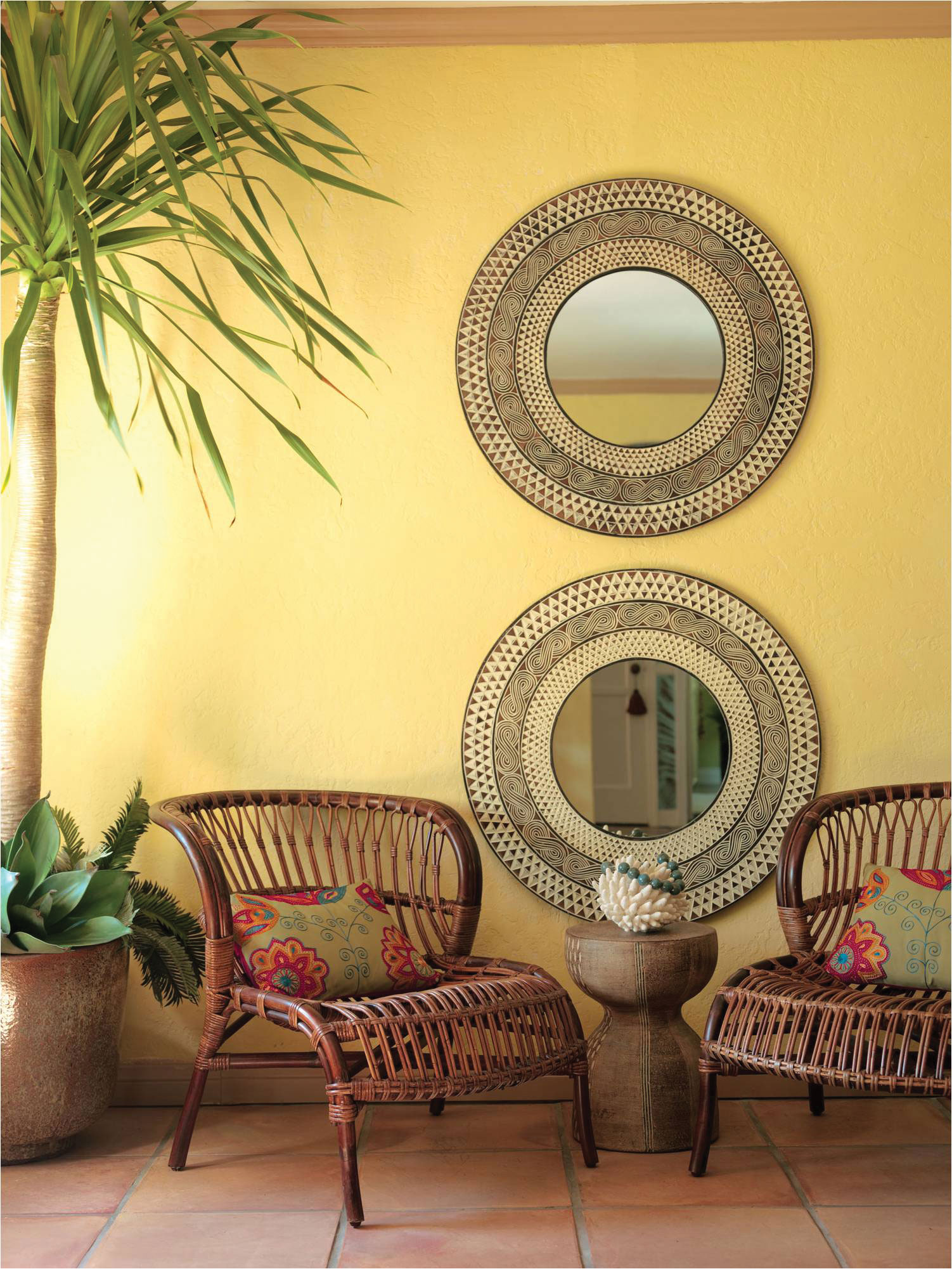 Yellow
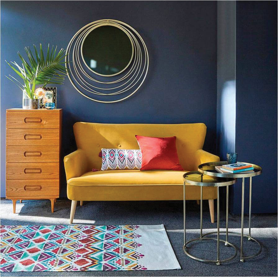
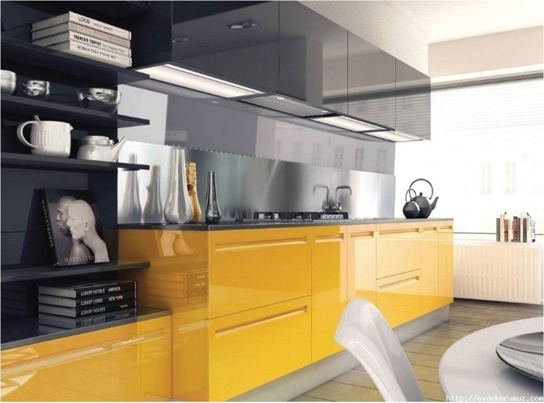
Yellow is a cheerful colour. It is usually associated with sunshine, energy and happiness. It also can spark creativity and encourage communication, which might help if you have teenagers at home! It also has the ability to evoke memory and imagination. Combined with lavender, it’s also thought to have healing properties.
Red
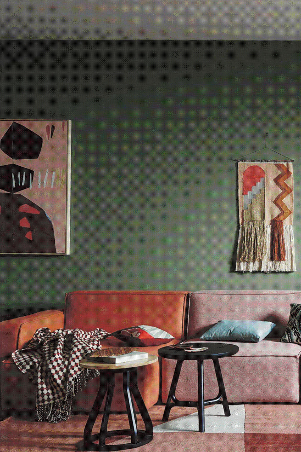
Red can be bold and dramatic or warm and earthy, depending on the tone. Deep crimson hues create passion and drama, while rusty shades can add a cozy ambience. Red is a stimulating colour, so is best used in areas where energy should be high, like a family room or entertaining space.
 Green
Green
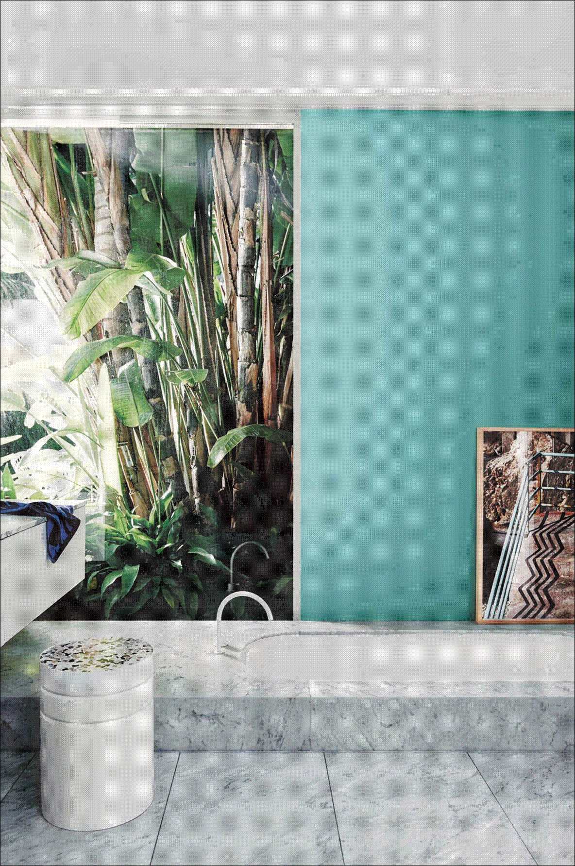
If you want a sense of calm, look no further than green. The connection with nature means that we associate green with peacefulness and balance and it also has associations with renewal, good health, and positive growth. The human eye can actually see more variations of green than of any other color because of our evolutionary history—surrounded by green in the natural environment; our ancestors had to be able to distinguish the slightest changes in the landscape to protect themselves from predators. (But now that we’re not expecting anything to jump out of the bushes, green is a wonderful way to bring the peace of nature inside!)
 Blue
Blue
Blue is everyone’s overwhelming favorite for a reason. It’s a constant in our lives, between blue sky and the ocean. There is also as a real trust factor with blue, that’s why many of our authority figures wear blue uniforms, and why blue is the most popular color for corporate logos. Blue also slows our heartbeat and respiration, giving it a calm, sedating effect and making it an excellent choice for bedrooms. If you like the idea of blue but want a sense of profoundness — with a little mystery — go with deep shades like indigo and midnight blue.
Pink
Pink can add a touch of feminine flair, and it has seen a huge increase in popularity over the past few years, with blush and ‘millennial pink’ shades being in vogue. Muted blush or grayish-pink hues can instantly soften any room, and darker shades of magenta add a punch of drama. Mixed with a bit of brown or grey it can also be used as a neutral that conveys calm, stillness, and beauty.
 Purple
It’s associated with spirituality, mystery, royalty, and creativity — and even a little eccentricity. But if you use it in the home, choose a shade that leans clearly toward a blue or a red undertone, such as a grayish lavender or a red-violet, which tends to make people more comfortable. True purple (often the top choice of preteen girls) can come on too strong.
White
White is all about purity, cleanliness, neutrality, and fresh new beginnings and with the popularity of Scandinavian design, more and more designers are leaning towards all-white walls and sparse white furniture. White interiors can feel fresh and modern, but can also feel very cold and sterile, so pay close attention to the undertones.
Gray
Gray stands for wisdom, intellect, and knowledge, and it’s a color we instinctively trust. It conveys authority and a firm foundation. Gray is a great neutral that you can use without pushing the boundaries too far, but it’s still classic, sleek, and sophisticated. Gray in the home used to be far less fashionable, probably because shades available on the market tended toward an industrial, battleship gray. Now, however, gray is much more versatile, taking on brown or blue undertones to work with almost any color you can dream up.
Brown
Brown speaks to reliability, stability and approachability. Brown accents such as wood tones, leather, and natural elements are a great way to warm up a space and make it feel homier in an instant. Brown shades are truly versatile, and go with any design style and mood.
 Black
Black
Just like that favorite little black dress, this colour has always been associated with sophistication, elegance and luxury. It’s most often used as an accent in the home, as all-black interiors can become dreary and overwhelming very quickly. Glossy or matte black accents, furniture and appliances are timeless and chic. Used correctly, black can actually expand your space instead of closing it off.
If you feel colour confident – then spend some time dreaming up a fun design on an accent wall.
At the end of the day, it’s important to choose colours in your home that speak to you. Be sure to consider the purpose of each room and how you want to feel while you’re in it. Light changes the way a colour looks at different times of the day, and also under artificial lighting – so consider all these things and get the paint brush out!
If this all seems too much, then leave it to the experts. The designers at Royal Palm’s new Design Center in Uvita are ready and able to help you create a full colour palette for your home, or just one room.
What is your happy colour?