Colour Me Confused

4 Easy Ways to Choose a Colour Scheme For Any Room or Your Whole House
 Building a new house in Costa Rica is an exciting venture for many of us. Sometimes it is our first custom home—our dream home.
There are always so many details to think about and many decisions to be made it can be confusing. One of the first decisions will be the floor colour. What size and what colour tile do I use? This is hard if you have not selected your whole house colours yet. Selecting items piece by piece does not make for a cohesive flow through a home.
Choosing an interior designer is an obvious choice. They can work with you on just your colour scheme and you do the rest, but they can also help you to coordinate all your furnishings, art and décor to work together beautifully. This is especially helpful if you are not here all the time.
If you prefer to take the reins and try doing it yourself here are some helpful ideas.
There are different options for the way this can be done:
- Traditionally, the colour palette would be selected by using the designer’s “Colour Wheel”.
- You can look at artwork and fabric you like to find pleasing combinations.
- You can look to nature – there you will find beautiful colours and no end of inspiration.
- You can also look at other rooms online or in a friend’s home to get ideas, or you can just choose your favourite colours and go from there.

 1 The Colour Wheel
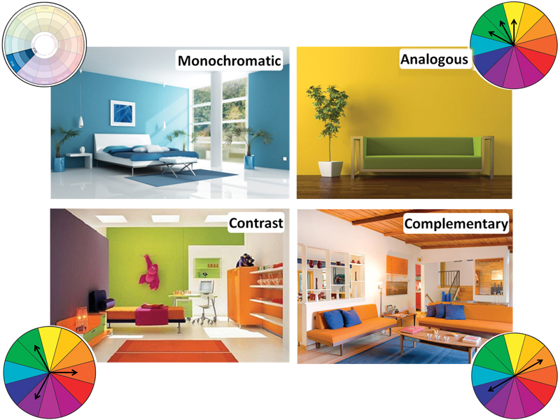
The colour wheel can help you create the colour scheme that works best for you. There are 4 types of basic colour schemes.
Monochromatic: The monochromatic colour scheme uses tone on tone in one colour with the addition of white or black to lighten or darken it. For example, in this scheme blue can become a pale sky blue or a dark midnight blue and other hues are used to create a calm and pleasing colour scheme.
Analogous: The analogous scheme uses colours that appear next to each other on the colour wheel. For example yellow will be used with green or orange, or blue will be used with green or purple. This creates a colourful and often soothing palette.
Contrast or Triad: The contrast scheme is more dramatic. Here, three evenly spaced colours are used together, such as orange, green and purple. This scheme definitely introduces more colour and energy into your home’s palette.
Complementary: Lastly we have the complementary scheme where two opposing colours, such as blue and orange, are used together and create a dramatic, bold and high energy colour scheme.
Within theses palettes we have warm colours and cool colors—Warm colours are the reds and oranges, and Cool colors are the blues and greens. Living here in the tropics, we might want to use cool colours in our palette. Have you noticed how hard it is to find ‘Warm White’ light bulbs here? They are usually the cool blue variety. Visually ‘cooling down’ a space can make you actually feel more comfortable.
2 Artwork and Fabric
There are ways to find inspiration through art and fabric too. Perhaps you brought down some great Tommy Bahama fabric with you, or you found a fabulous piece of art. Now you have a basis for your colour palette! Look for a colour in the design that you like then check out the colour wheel to get great ideas using that colour. Inspiration is never far away!
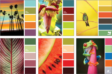 3 Look to Nature

As we are lucky enough to see around us almost every day, bugs, birds and butterflies showing some the most amazing array of colour combinations—not to mention all the tropical fruits and flowers. We can always take a cue from nature for our colour inspiration; from landscapes and sunsets, to the flora and fauna all around us. Wherever I look, I am still in awe of the staggering beauty of this place we call home.
Colour has a fascination for me—I love colour! Many people do, and there is good reason. Colour is everywhere and is proven to influence the way we feel. Even the early cave men felt they needed to use colour in their story-telling art, and gradually with the help of mineral and biological sources, ancient cultures developed a fabulous range of colours that became available to their artists and fabric dyers.
Today, we are better able to understand the psychology of colour, so marketers and colour forecasters can persuade us to choose to buy one product over another, and determine the colour of our fashion and our furniture. That is the power of colour!
The origin of any colour is often a fascinating journey back into time. Many of the ancient techniques for extracting the pigments are either lost, became too costly or could not keep up with demand, so they began to be synthetically reproduced during the Industrial Revolution.
Pigments from spices like paprika, turmeric and saffron, and metals like iron, lead and copper produced beautiful colours as have many precious minerals and stone. Nature provides many other interesting sources for pigments.
 Cochineal is one of the most popular reds and is made from the crushed bodies of cochineal beetles. Still used today it is colour additive E120, and is the red in Cherry Coke!
Purple: The Murex sea snail species cries ‘purple tears’. When removed from its rock, the snail ‘weeps’. This yellowish liquid turns purple when exposed to the air. Our Boruca people here in the south ‘milk’ this mollusk once a year (legally at Playa Piñuelas), and use the purple colour in their weavings.
Black: A medieval black ink was made from wasps. Oak trees produce galls when invaded by wasps. These nut-like growths, when squeezed on paper, give an intense black color.
Indian Yellow was rumoured to be made from the urine of Indian cows that were fed exclusively mango leaves. This was never proved and it was more likely a leaf-based pigment from, a large tree-like shrub called the Purree. India has given us many other wonderful organic pigments including Indigo, which is crushed leaves from the indigo plant.
4 Other Sources for Inspiration
For other colour inspiration, check out some of those great online decor sites. Collect images of rooms you like, look at the colours and understand why you like them. Use these images to refer to when you are making decisions for your home.
Whatever colour combination you choose, make sure you put some thought into this important detail. Here in Costa Rica, we will generally have a less formal approach, especially if this is our ‘home-away-from-home’. For many, this is our cottage in the jungle—an escape from winter. But formal or casual, a well planned colour scheme will give you a cohesive colour flow throughout your home.
Choose the palette you love and work from there. Just keep to your plan and you will be happy with the results for years to come.
Until next time…
Shelagh
Royal Palm Interiors – Uvita – 2743-8323
royalpalminteriors.com
Like us on facebook.com/RoyalPalmInteriors