How to Find Your Signature Colour and Use it in Your Home – Part One
By Shelagh Duncan
This month we’ll explore how to find your signature colour, and next time we’ll look at what to do with it once you’ve got it.
We are fortunate enough to live in one of the most beautiful places on earth! Wonderful colours surround us each and every day. Colour is a powerful tool, and professionals use all the time in advertising, product packaging, fashion, interior design and even road signs. The colours are not chosen because the designer likes them, they are chosen because they communicate. Colour can inspire emotions, stimulate appetites, improve vision and calm you down.

In the advertising word, the colour of the packaging and labelling defines a product. The colour of a logo has been shown to improve brand recognition by up to 80%, and becomes known as the signature colour for that product. Coca-Cola’s red and white is instantly recognizable, as is Tiffany’s Blue and UPS Brown. In interior design we use it to set the mood or atmosphere in a home, as well as create a focus, or an illusion of space and depth. But how do you find your colour? High-powered ad agencies figure this out for the retail world but in our homes how can we find help?
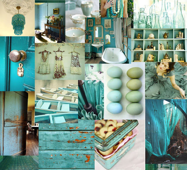
We all have a favourite colour and love to wear it because it makes us feel good, and if we feel good – we look good! Is this our signature colour? Well, not necessarily. However, your closet is where you start the search. What is the colour you love to wear? Which colour scarves are your favourites? When you make an impulse purchase for your home – what colour do you choose? Which flowers do you love the most, what colours are your iPod, your sports bottle your favourite candles, and the car of your dreams? And when you see a room you love – identify what colours are used in that room? Start an Inspiration Folder and add pictures from magazines, adverts, online sources etc. and collect them together. You never know where you might spy a colour that calls your name: flowers in the garden, a framed painting, a store display or your own wardrobe. Keep a camera handy to capture anything that catches your eye.
Look carefully at all these things and you will start to see a trend. Is the overall colour direction beginning to emerge….? When you can identify that – you will have your signature colour. But, that is just the beginning. Now you want to know how to use your colour in and around your home.
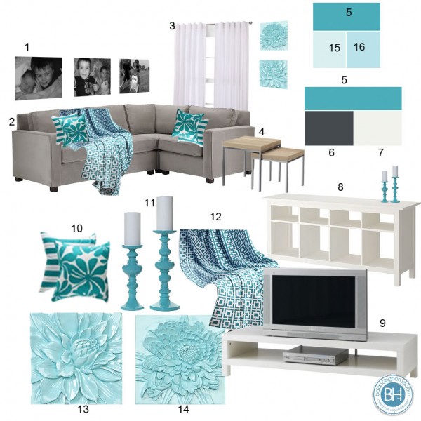
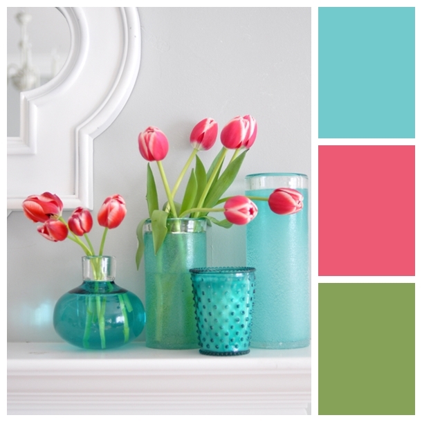
If you find you already have items at home in this colour – which you probably do (but perhaps they never really seemed to work very well or ‘go’), then now is the time to collect them up. In design we feature a colour – we don’t drown a room in it. Usually you would select a colour palette based on your colour and select either complementary or contrasting colours to work with it. This doesn’t mean you have to have a wildly colourful house that resembles a daycare more than a home. If you choose your colours with care you can transform your space into almost anything you want it to be.
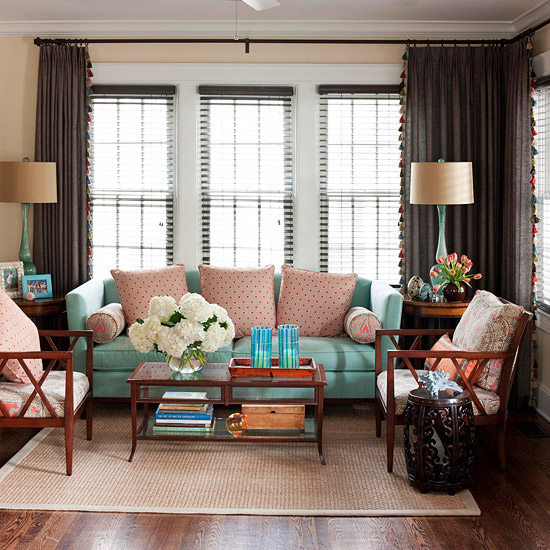
Colours create mood and ambience, and are very important in creating the feeling you want for your home. For example, you can select a family of neutrals and use your colour thoughtfully, as your accent, and create a rhythm as your eye passes from one thing to another. Or, you can respond to your environment and create a beach-house look or tropical paradise, just as easily as a sleek and modern interior. Let your colour guide you.
Check out the Benjamin Moore and Sherwin Williams sites for some great colour palette ideas, and I am sure you will find your signature colour there. And when you do – don’t forget to write the name down! Think about purchasing a quart to play with at home – paint an old picture frame, an ornament or vase, (even a chipped one – you will hardly notice that chip or crack when it has taken on a whole new colour personality).
http://www.benjaminmoore.com/en-us/for-your-home/our-favorite-paint-colours-colour-schemes
Also, Sherwin Williams, in a stroke of genius, have partnered with Pottery Barn and West Elm to provide colours for their fall and winter 2013 collections. These companies have taken the guesswork out of the decorating equation and have selected hues that match each of the brands’ furnishings and decor items. So, basically you can get that ‘catalogue’ look – right down to the wall trim in your home. They have also just teamed with William Sonoma to produce their colours too. The first palettes will be available later this month, and according to a press release, the companies plan to create new selections twice a year. Check out the Sherwin Williams web site to find your colour, and a palette that works for you.
http://www.sherwin-williams.com/homeowners/colour/find-and-explore-colours/pottery-barn-collection/
Now you have found your colour, start looking around your home and think about what you already have in your colour, and how best to use them. Next month we will be looking at which colours work best in different areas to help you make those final decisions.
Until next time…