How to Find Your Signature Colour & Use it in Your Home – Part 2
 By Shelagh Duncan
Last month we helped you find your own signature colour, and I hope you have your paint colour picked out by now. This time we are offering some thoughts on where certain colours work best. Remember, you do not have to repaint the whole house, or even the whole room. Often a little colour goes a long way, and it can be introduced in window coverings, pillows or art, as well as other home accessories. If you really love your colour (which you obviously do) and want to make a statement, then get out the paint brush and roller and have fun!

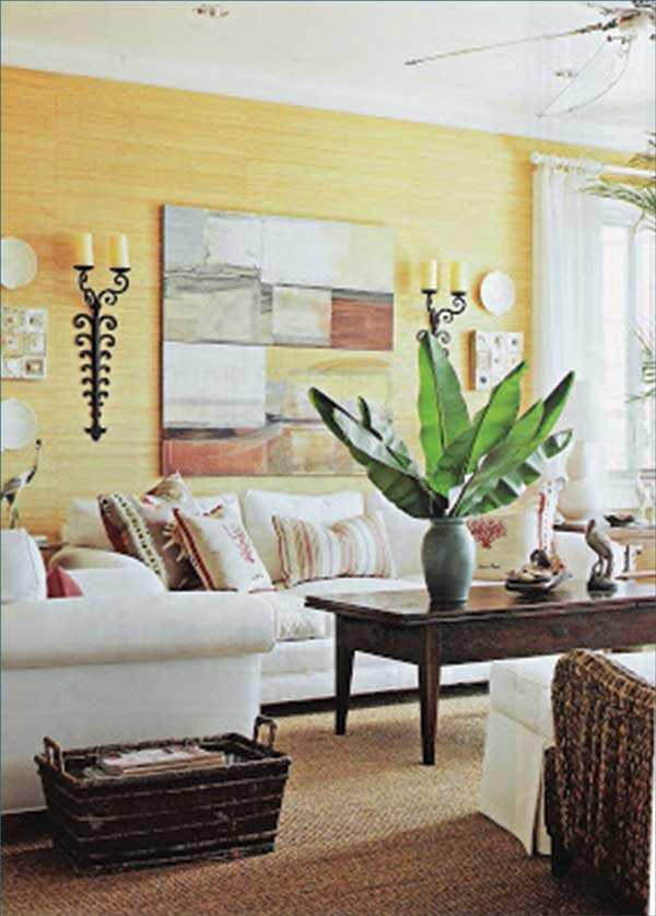
Living room and foyer paint colours. Warm tones like reds, yellows, and oranges, and earth tones like brown and beige often work well in both the living room and foyer, because they’re thought to stimulate conversation. “These are colours that encourage people to sit around and talk,” says Kate Smith, a colour consultant in Lorton, Va. “You feel the warmth, the connection with other people.”
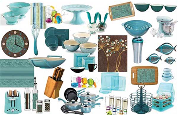 Kitchen paint colours. Reds and yellows can be great colours in the kitchen as well as in the living room and foyer. But watch out if you’re watching your weight – in addition to stimulating conversation, colour consultants say that red may prompt you to eat more, if only subtly. “If you’re on a diet, you might want to keep red out of the kitchen,” says Leslie Harrington, a colour consultant and a noted expert on the use of colour in residential and industrial decor. She adds that the restaurant industry has long recognized the appetite-stimulating power of red decor. However, blues are said to decrease appetite. It must be true – when was the last time you saw blue food…? But, you don’t have to change the wall colour. What about just accenting with blue in your kitchen!
Dining room paint colours. Because it’s stimulating, red decor can be great for a formal dining room. In addition to encouraging conversation, it whets the appetites of your guests. “If your dining room is red, people may think you are a better cook,” says Harrington.
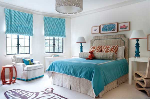 Bedroom paint colours. The bedroom is where you go to relax and reconnect with your partner. Cool colours — blues, greens and lavenders — can be great choices here, because they are thought to have a calming effect. The darker the hue, the more pronounced the effect is believed to be. “Reds tend to increase blood pressure and heart rate and stimulate activity,” says Harrington, whereas “blue does just the opposite. That’s why we think of it as calming”.
Bathroom paint colours. Whites have always been popular choices for bathrooms, in large part because they radiate cleanliness and purity. But nowadays the bathroom is also used as a private retreat for relaxation and rejuvenation. Says Harrington: “Most people feel comfortable with blues and greens and turquoises because these colours give a sense of being clean and fresh – and calm.”
But spa colours in the bathroom make sense only if they flatter you. “When you look in the bathroom mirror, you want to look great,” says Smith. “If you would never wear a particular colour, don’t paint your bathroom that colour. That’s a recipe for disaster.”
Home office paint colours. The name of the game here is productivity: the faster you get your work-related tasks finished, the more time you’ll have to spend enjoying the beach or the pool. Colour consultants agree that green can be a great choice for a home office. “It’s one of the best colours to be surrounded by for long periods of time”. And says Harrington “Green is the colour of concentration”.
 Having said that, maybe because we spend so much time outside, the calm “Sky Blue” balances all that ”Leaf Green” jungle and helps put us back into that Pura Vida mindset once our work is done!
I hope you enjoy discovering your signature colour, and have even more fun decorating with it!
Until next time