Will YELLOW be the new BLACK?
 By Shelagh Duncan
Apparently yellow is going to rule the decor scene for the next while. It is a cheerful, happy color that has many moods, and works with lots of other colours. Yellow will dominate they say, but there is a trend to the pastels, as well as more rich and saturated colours. But, the general feeling is – FUN!
We will enjoy using yellow because of our fabulous tropical locale but perhaps the trend will be modified for city folks: it could be paired with black or organic colours for a more chic, sophisticated look.

The new bright ‘sun kissed’ colours slated for 2014 are balanced with the influences of nature – which is perfect for us. Khaki, or Army/Surplus Green as the trend setters like to call it, still features strongly. It is a staple, and pairs beautifully with the brights as well as the pastels. Other earthy tones and textures will be popular too, and there will be interesting and unusual combinations of colours and patterns as we let our personal expression loose. The runways for 2014 were a riot of colour, pattern and texture, with very evident tribal influences. Street art and metallic detailing, together with black-and-white were showing up everywhere, and loose and casual was more evident than up-tight and formal. Mixing-and-matching of patterns and textures will continue into the home, and give us freedom to show our own personality in many different ways.
Also on the home front, we’ll see certain, more decor-friendly, interpretations of runway colours showing up in fabrics, paints and furniture. The brighter colours can be ‘calmed’ with softer shades of natural, organic colours that will let the bright colours pop.
But who decides this? Who says we have to paint our walls yellow, or have to get a Khaki couch? Each year, in fact for each season, groups of colour experts agree on the colours and trends that reflect what is going on around us, and what they see as the direction going forward. Influences run the gamut from social issues and politics, to the environment, the economy, and even pop culture. They will collectively interpret that information into saleable colours for manufactured products across all industries, as well as for advertising, fashion and home decor. Erika Woelfel, director of color at Behr Paints says, “Even people talking about the decline of bees can influence the inclusion of honey-golden tones. Fashion, of course, she adds, remains a major influence on interiors. “If a color remains popular in fashion for at least two seasons, you see it filtering down into objects for the home”. It is an understanding of the global influences that provide the most useful information, and it is the input of so many Colour Professionals, that gives each Forecast its validity.
The 50 year old Pantone Color Institute sets the colour stage with their colour palettes, and is arguably the leader in this field. The Color Marketing Group, and International Colour Authority are also very important Forecasters, and major paint and fabric manufacturers have their own colour design professionals. It all starts on the runway, and continues on into our homes.
So what is hot and what is not? As a designer I love to be ‘in the know’ about the newest trends and colours. Living here makes it a lot less relevant than working back home in a big city. However, we should love our home and what is in it, so when it is time for something new – why not be a bit ‘on-trend’ too!?
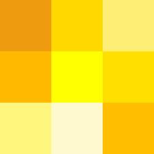
As we see, YELLOW is big, in many different shades, TEAL BLUE combines beautifully with so many other colours, RED keeps popular, but now is a little stronger, and versatile KHAKI brings an organic message, as well as providing an earthiness when paired with the brighter colours.
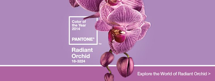
If you were to mix two of our featured 2014 colours – Teal and Red – you would produce Purple. And, interesting enough the big colour that has just been announced for 2014 is Pantone’s “Radiant Orchid”. This colour is a deep, rich purple that “intrigues the eye and sparks the imagination”, according to Pantone’s Leatrice Eiseman. It’s not a colour you will want to overuse though – keep it for your accents. Shades of purple are actually included in many of the themes this year, and this rather spiritual colour offers a wonderful versatility and vibrancy when paired with yellow, orange or even red. Remember it’s all about FUN!
Along with the new Forecast colours, comes a palette relating to each design ‘theme’. For 2014 we have:-
- Techno Color – Acknowledging the advancement of technology and how it is impacting the world of design
- Physicality – Speaking to the colors of power and energy counter-balanced by the presence of the hues that express the necessity for introspection and calm
- Sculpted Simplicity – A sophisticated palette recognizing shape, form and structure and how important they are to the world in which we live.
- Fluidity – Understanding the inevitable human need for life-sustaining cool water tones and the underwater world.
- Collage – The gathering place for found objects that are well worn and somewhat nostalgic -a poignant familiarity.
- Intimacy – A softness that implies a certain affinity and relationship that are expressed in tints and tones that are inviting in nature and softly tactile.
- Moda – Svelte and voluptuous, Moda speaks of attention to detail and the drama of high fashion when translated into interiors, all at once theatrical, fashionable, whimsical.
- Tribal Threads – Are as varied as the tribal diversity they represent, yet they construct a universal linkage of artistic appreciation rooted in personal expression.
- Eccentricities – Offersing a sense of adventure, wit, experimentation and discovery. It’s a tongue in cheek , break-the-rules palette that bravely mixes colours and designs.
In these palettes we see the pastels, the brights, and the earth tones. The main difference this year, is that there is a mixing of all the theme colours – pastels are used alongside bright, vibrant colours, and earth-tones are paired with both pastels and brights. Mix-and-Match has never been better – or more fun!
So what’s the hot color for 2015? It depends which forecast you check. But whether it’s Aubergine, Sweet Lime or Orange Tango, one thing is for sure—the forecasters are already hard at work looking for what’s next.
Until next time…