How to Create a Cohesive Colour Flow Throughout Your Home
Colour preferences vary as much as personalities, some folks are loving the bright and the bold, while others feel most secure surrounded by neutrals. The good news is that when it comes to colour, there really is no “correct” palette.

by Shelagh Duncan
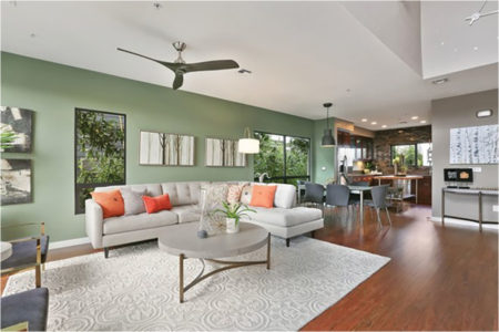 That being said, we’ve all been inside homes where an explosion of colour created a chopped-up feel between rooms so you don’t know where to look first. Living in the tropics and seeing all the bright and beautiful colours around us can make us feel we need to bring it all indoors. However our indoor living spaces generally need a calmer feel—too much disjointed colour can create a restless atmosphere.
Here are some well chosen tips to help keep that Calm, but enjoy the Colour! So choose the ones that work best for you.
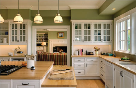 Pick a Flow-Through Paint Colour
One simple way to create a cohesive feel is to use a consistent paint colour on the walls of connecting spaces. Most of our homes have an open floor plan, so it’s best to choose one colour that is going to serve as your main colour or your neutral. That doesn’t mean it has to be beige or white or gray. But the foyer, the hallways and the main connector room for example, should all be the same colour.
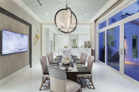 Pay Attention to Sightlines
I frequently talk with clients who want more variety in their wall colours. In those cases, I suggest they look at the sightlines. When you’re standing in the living room, what other rooms will you see? If you have a view into the kitchen, the dining room and the entry, then the colours for those spaces need to work well together.
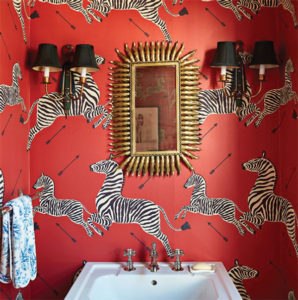 Restrict the Boldest Colours to Enclosed Rooms
Rooms out of the sightline of other rooms are good places for going a bit wild. Any room enclosed by four walls is a great place to have some fun. That little powder room or laundry room can be yellow or red with zebras if it makes you smile!
Choose Colour Groups
One way to increase the likelihood that a colour scheme flows from room to room is to limit yourself to colours in the same temperature family. You might want to keep to a warm colour palette of reds, orange or terracotta, or a cool scheme, with grays, greens and blues. This is an easy way to work with stronger colours while keeping the flow.
Another option is to select one or two colours and then use variations of it. If the main colour is blue, you might select a gray-blue, a pure blue and a navy as you move from room to room. The same concept can be used for decorative accessories.
For wall paint, you can ask the paint store to create a “tint” of a particular colour, perhaps knocking down the main colour by 50 percent, which the mixer can do by adding white. They can easily create a lighter or darker version of your colour and this is a good way to unite spaces without putting the same colour everywhere.
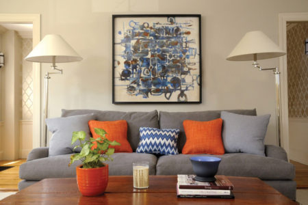 For Bold Colours, Use them as Accents
Accessories are a less expensive way to introduce dramatic colours than purchasing a sofa or rug in the same tone, and they’re also easier to swap out should you tire of a colour. Limiting bold colours to art and accessories also helps you avoid the shock value that can happen when a dramatic shade is painted on all four walls. Find ways to inject the colour that makes rooms interesting and exciting without feeling overwhelmed by it. Bright or strong colours are good when you want to highlight something or create rhythm, and should be used in smaller quantities.
Use the 60-30-10 Formula
For you left-brain folks, another way to create a cohesive flow from room to room is to think of the palette for your home as a math problem. You can use a base colour that you really like as 60% to 70% of what you’re going to paint for your interior, and your next colour needs to be 30% to 25%. Then you can do your accents of 10% to 5&.
To pull the colours throughout the home, you might use a variation on the above scheme in an adjacent dining room. The walls might be painted the Snowdrop blue, and perhaps Autumn Blaze could be used as an accent, with a few small darker blue accessories providing the 10% dose of colour.
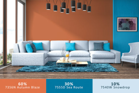 This is a bit old-school, but is an uncomplicated way to help you select colour. Another way to use this ‘rule’ is to use large pieces of furniture, walls and floors as the 60%, the secondary 30% comes from smaller furniture pieces, window coverings etc, and the 10% accent colour comes from lamps, pillows, art and accessories.
As long as you keep it cohesive throughout your entire home, it’s going to make sense. So find the colours you love and have fun.
Until next time…
Shelagh
Royal Palm Interiors – Uvita – 2743-8323
royalpalminteriors.com
Like us on facebook.com/RoyalPalmInteriors

